About Client
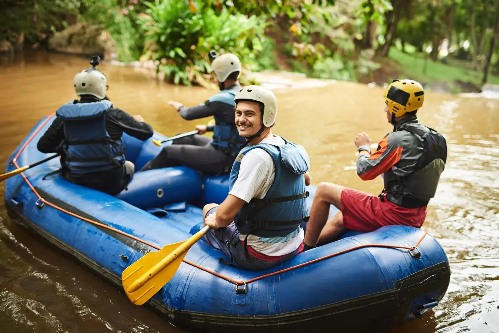
Our client from Perthshire, Scotland has been running exciting outdoor adventures across Europe for over 22 years. They offer activities like whitewater rafting, quad biking, canyoning and tubing. These are all the fun stuff people love.
But their website was old and not bringing in enough visitors. This meant fewer bookings and less business.
They reached out to us for help building a fresh new site that looks great and helps turn visitors into customers.
Task in Hand
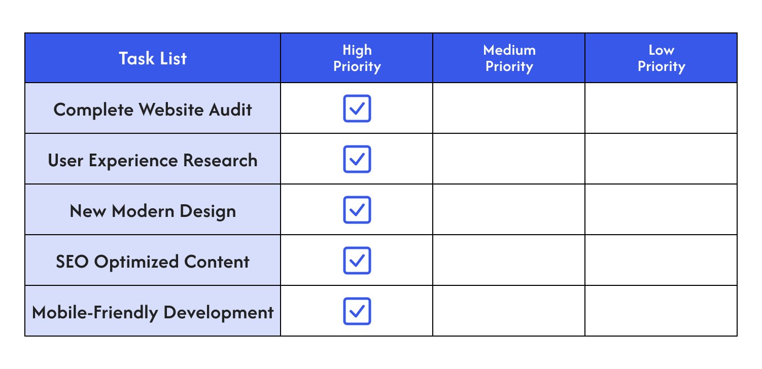
These tasks were chosen to make the website look better, work well with search engines, and be easy to use on any device. The goal was to attract more visitors, keep them engaged, and help increase bookings for rafting trips.
Approach
Once we understood what needed fixing, we got started. Here’s a step-by-step look at how we handled each part of the project.
1. Complete Website Audit
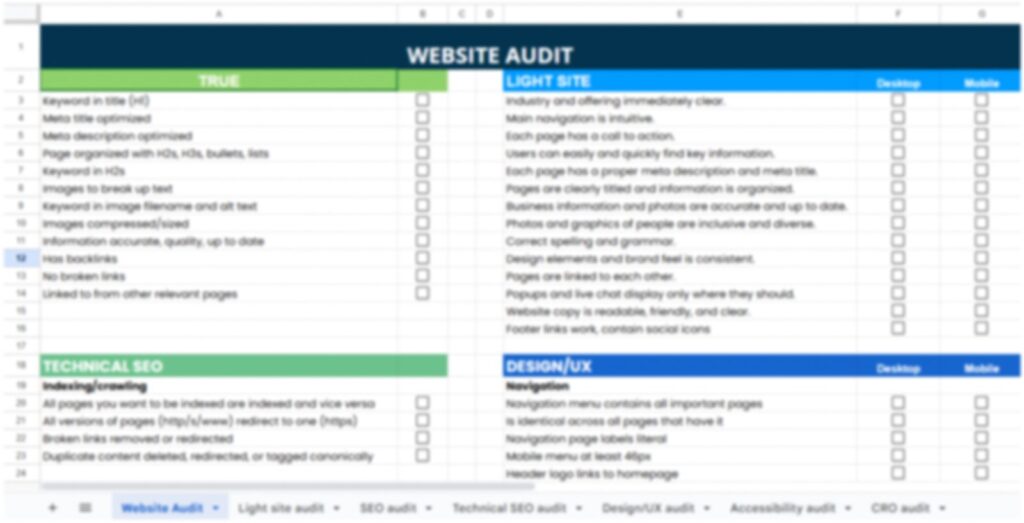
We began by doing a full audit of the website to find what needed fixing. We looked at how the site was built, how it worked, and how good the content was.
This audit gave us a clear picture of what to improve so the site would be easier to use and perform better. It was the first step toward helping the site attract and keep more visitors.
2. User Experience Research
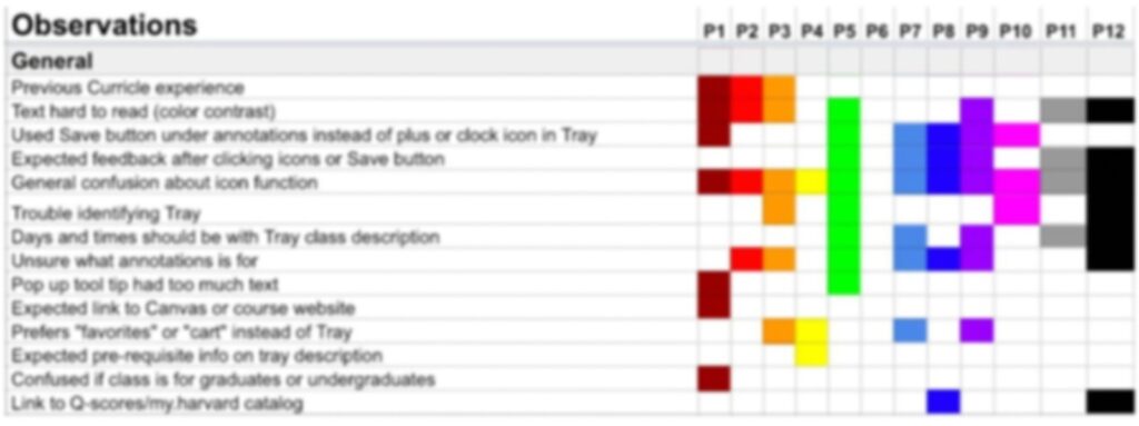
After reviewing the site’s setup and how it worked, we looked at how real people used it. We talked to users, sent out surveys, and watched how they moved through the site to find where they had trouble.
This gave us a clear idea of what needed fixing. The goal was to make the site easier and more enjoyable for visitors to use.
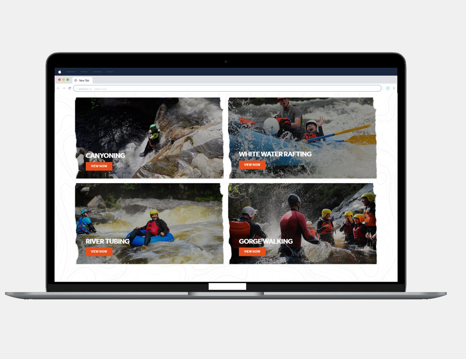
3. New Modern Design
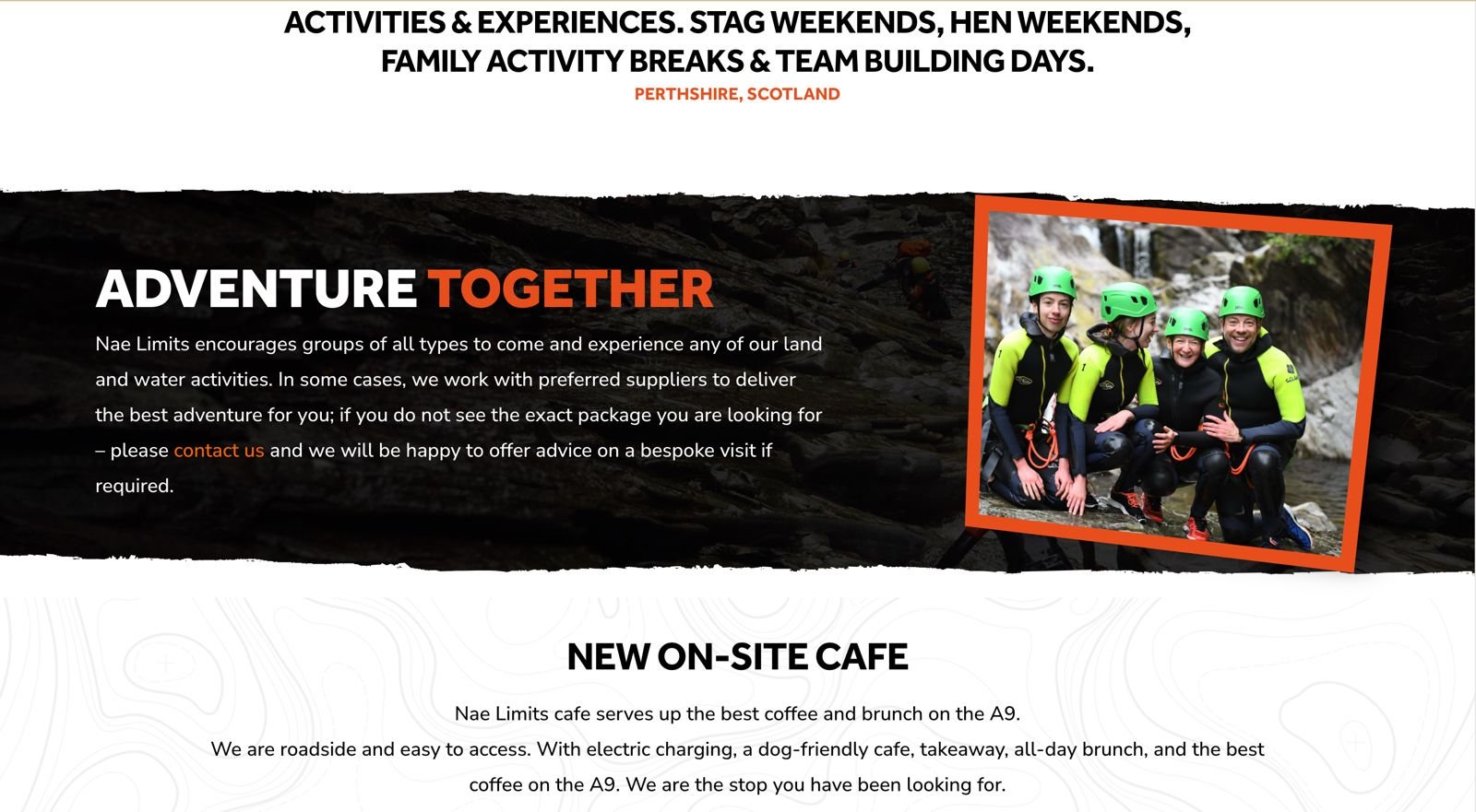
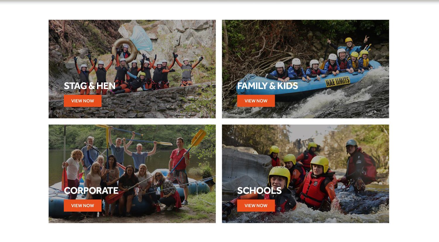
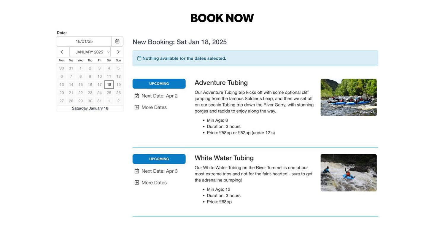
Once we knew the problems and what users wanted, we worked on a fresh, modern design for the website. We wanted it to feel exciting and match the adventurous spirit of rafting. We used strong visuals, simple layouts, and easy navigation to make the site both attractive and user-friendly.
The new design was about more than just looks. It was made to help visitors find what they needed quickly and book their adventures without any trouble.
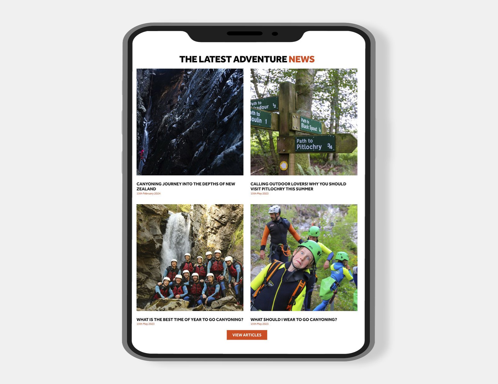
4. SEO Optimized Content
To help the website reach more people, we worked on creating content that was easy to find on search engines. We rewrote important sections to include the right keywords while keeping the language clear and engaging. We also improved titles and descriptions to make the site more attractive in search results.
The new content was meant to boost search rankings and give visitors helpful information. This made it easier for potential customers to find the site and feel excited about booking their next adventure.
5. Mobile-Friendly Development
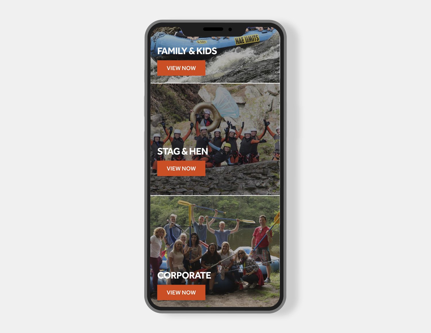
Since many people browse on their phones, we made sure the website works well on all devices. The design adjusts smoothly to different screen sizes, making it easy to use on mobile.
Now visitors can explore the site, find what they need, and book their adventures easily on a phone, tablet, or computer. The goal was to make the experience simple and convenient for everyone.
Results
More Visitors
The new website brought in more people, thanks to its fresh design, mobile-friendly features, and improved content.
More Bookings
With a smoother booking process and better layout, more visitors turned into customers, leading to an increase in bookings.
Happier Users
Visitors spent more time on the site, exploring everything it had to offer, which showed they found it easier and more enjoyable to use.