About Client
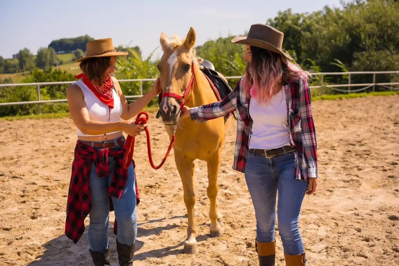
Our client, a horseback riding business based in Tennessee, offers scenic trail rides, riding lessons, and outdoor experiences perfect for families. With their friendly horses and beautiful routes, they’ve become a go-to spot for both locals and tourists looking for a memorable adventure.
But their website wasn’t keeping up. It looked outdated, didn’t work well on mobile, and made booking a ride harder than it should be. As a result, they were missing out on potential customers.
That’s when they reached out to us. They needed a clean, modern website that not only showed off what made their ranch special but also made it easy for people to book and connect with them online.
Task in Hand
For this project, our goal was clear. Build a website that truly reflects the ranch experience and makes it easy for people to book, no matter what device they’re on.
Approach
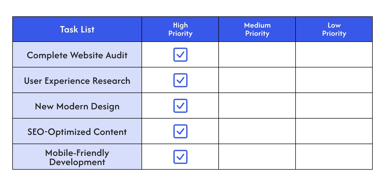
Once we understood what needed to change, we got to work. Here’s how we tackled the project step by step:
1. Complete Website Audit
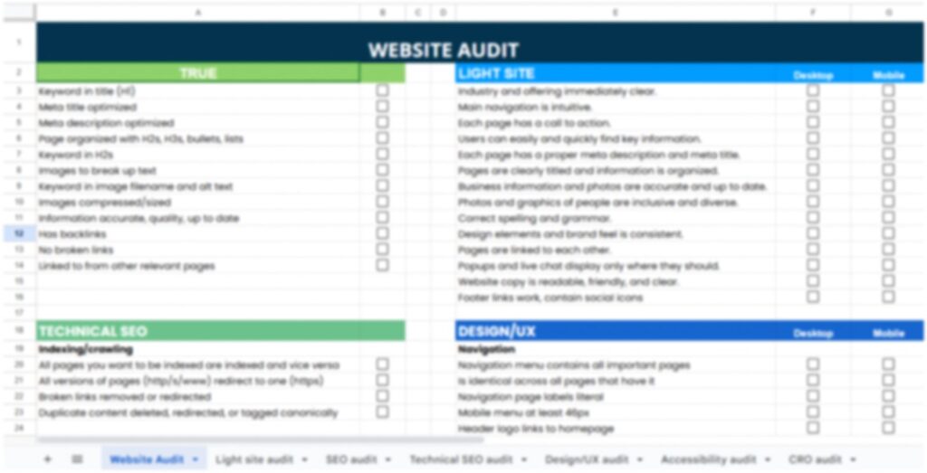
We started by reviewing the entire site to figure out what wasn’t working. That included layout, content, and overall performance. From there, we mapped out exactly what needed to be improved to better serve both the client and their customers.
2. User Experience Research
We looked closely at how people were using the site. Where they were getting stuck, what they were ignoring, and what felt confusing or clunky. These insights helped us redesign the experience to be simple, clear, and easy to use. Booking a ride had to feel natural and stress-free.
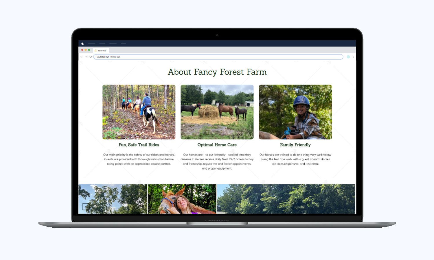
3. New Modern Design
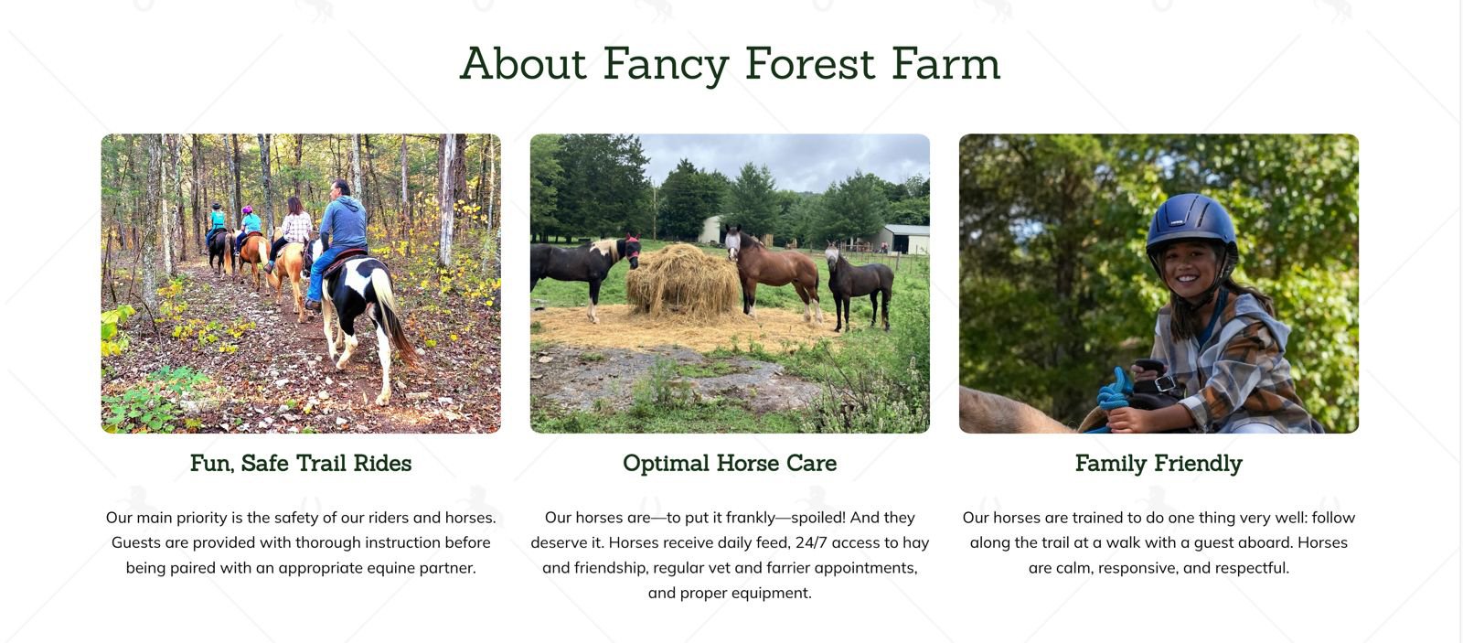
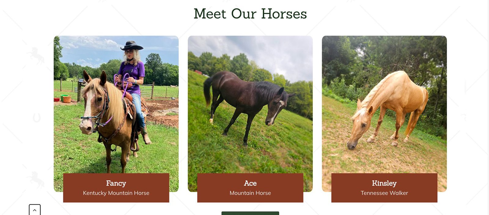
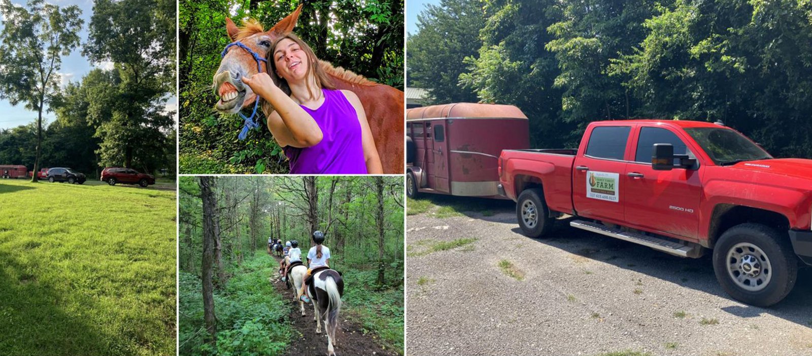
We gave the website a full visual upgrade. High-quality images, clean layouts, and intuitive navigation helped bring the brand to life. The new design highlighted their services in a way that felt inviting and easy to explore.
4. SEO-Optimized Content
We rewrote the content to better reflect the ranch’s personality and make everything easier for visitors to understand. While we were at it, we also made sure it was optimized for search, so more people could discover the site and quickly get what the business is all about.
5. Mobile-Friendly Development
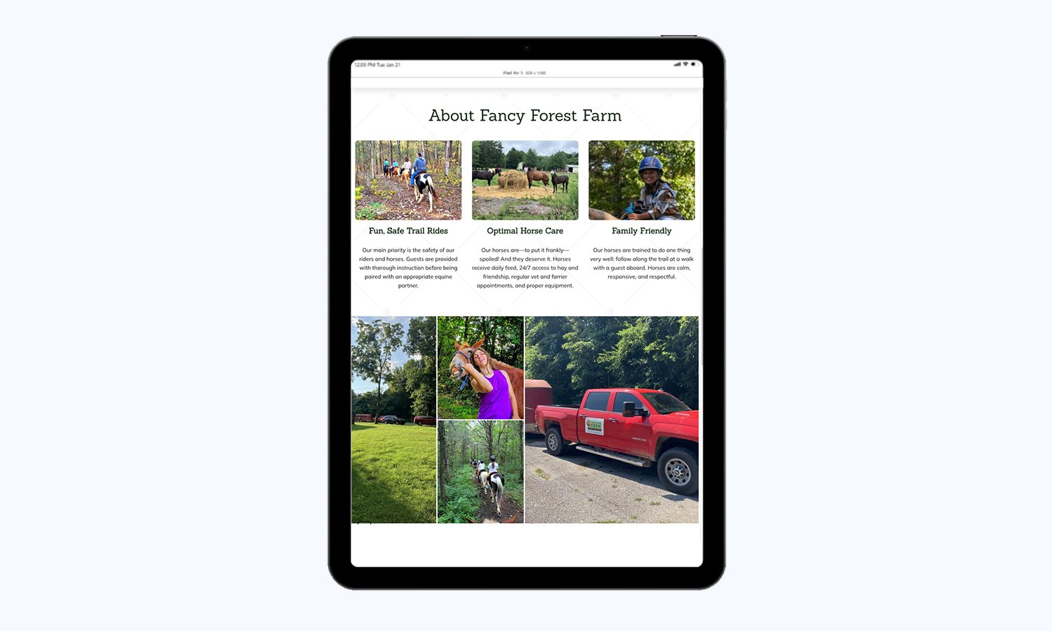
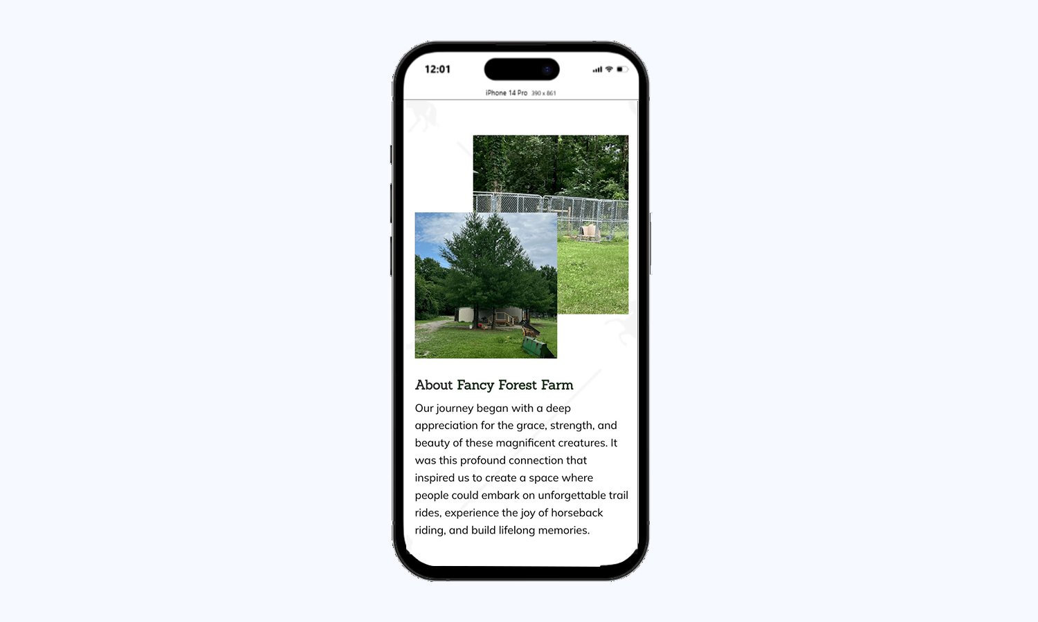
Since most visitors were coming from their phones, we made sure the site worked perfectly on every screen. No awkward zooming, no broken layouts, just a smooth and easy experience from the first tap to the final click.
Results
Increased Bookings
The new design and simplified booking process made it easier for visitors to take action. As a result, ride and lesson reservations went up noticeably.
Better Mobile Experience
The mobile-friendly upgrade paid off. Visitors could now browse and book from their phones without frustration, leading to a 40% jump in mobile engagement.
Higher Visitor Engagement
With better content and a clearer layout, people were spending more time on the site, exploring services, and booking their adventures with confidence.