About Client
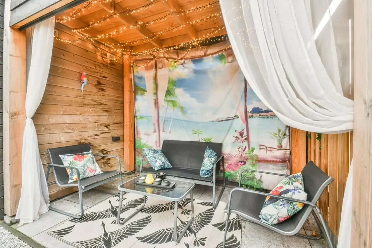
Our client owns a beautiful set of beachfront vacation rentals along Florida’s Gulf Coast. From cozy family spots to luxury coastal getaways, their properties are perfect for travelers looking to relax by the ocean.
But there was a problem. Their website wasn’t converting visitors into bookings. Despite all the stunning homes and strong reputation, the online experience just wasn’t doing its job.
That’s where we came in.
Task in Hand
The goal was simple. We needed to figure out why people were dropping off before booking and fix it. That meant improving how the site worked, how it looked, and how easy it was to use on every device.
Approach
Now that we knew what needed fixing, we got right to work. Here’s a step-by-step look at how we tackled each part of the project:
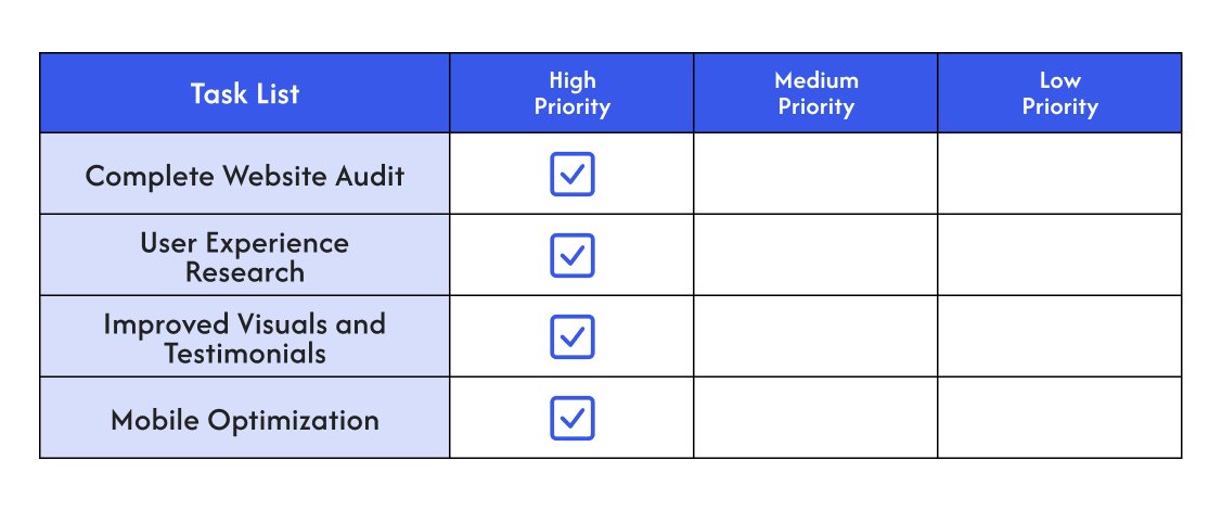
1. Complete Website Audit
We started by going through the entire website to see what was causing the drop in bookings. We looked at how the pages were laid out, how people moved around the site, how well the content was written, and whether everything was working properly.
This gave us a clear picture of what needed to be fixed. We focused on making it easier to navigate, improving how fast it loads, and making the overall experience better for every visitor.
2. User Experience Research
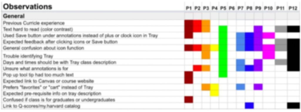
After the audit, we took a closer look at how people were actually using the site. We ran short surveys, checked heatmaps, and watched session recordings to understand where users were getting stuck or dropping off.
We used those insights to improve the layout and overall flow of the site. The main goal was to help visitors find what they needed quickly and make it easy for them to book their stay without getting confused or stuck.
3. Improved Visuals and Testimonials
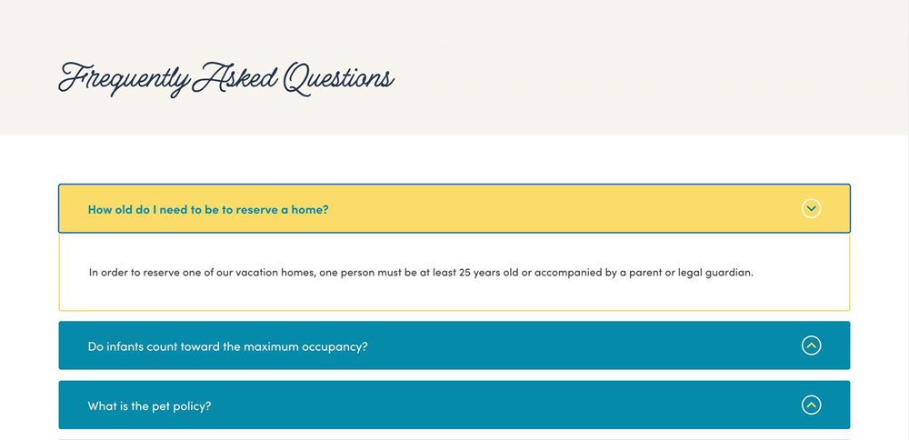
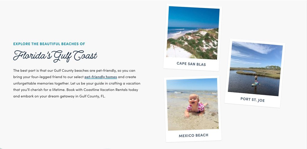
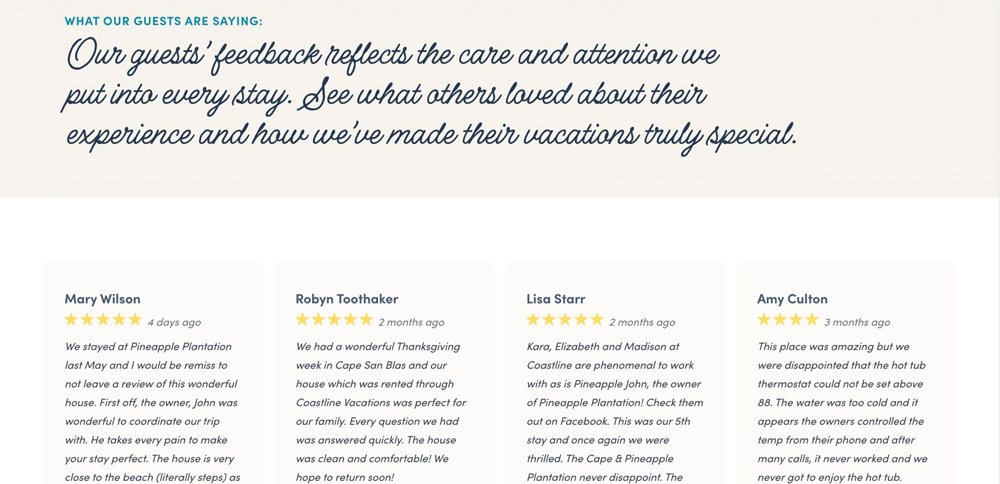
We wanted the website to feel more trustworthy and inviting, so we upgraded the images and added real reviews from past guests. The new high-quality photos highlight the beauty of each property, while the testimonials share what others loved about their stay.
Together, these updates helped the site feel more personal and convincing. Visitors could see what to expect and feel more confident about making a booking.
4. Mobile Optimization
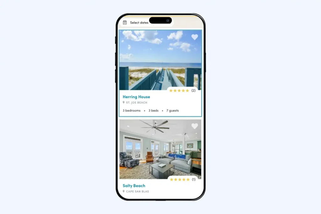
As more people use their phones to plan trips, we made sure the website felt smooth and easy on mobile. We redesigned it so everything fits perfectly on any screen and works well with taps and swipes.
We also speed things up so pages load quickly. If someone is browsing homes or booking their stay, the whole experience now feels fast and frustration-free on both phones and tablets.
Results
More Visitors
The updated website attracted more visitors, thanks to its improved design, mobile-friendly features, and engaging content.
More Bookings
With a smoother booking process and better visuals, more visitors turned into customers, leading to a noticeable rise in bookings.
Better User Feedback
Visitors found the site easier to use and navigate, spending more time exploring properties and leaving positive feedback about their experience.

